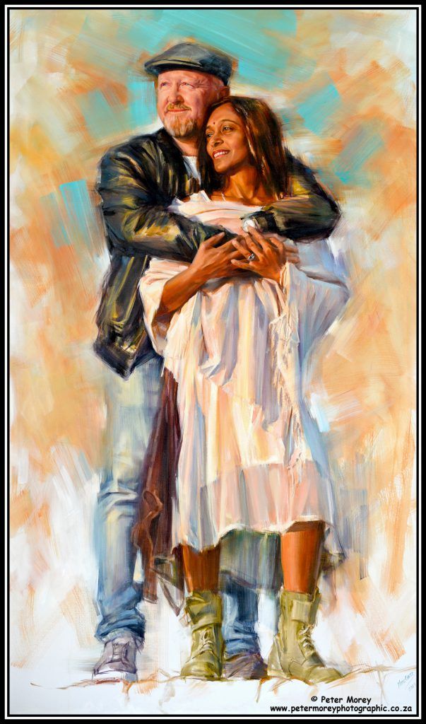
Technique or Inspiration? What is more important? Ultimately, art happens in the viewer’s mind. It does not happen in the artist’s inspirational feelings or in his paintbrushes. In other words, even though creativity is definitely a state of mind, this state of mind is clearly carried forward and executed as a discretionary act. Technique requires scientific knowledge of the causes and effects of the different components used in, for example, oil painting. The rational choices the artist makes during execution regarding these components directly influence the viewer’s perception and experience.
Technique Components
Examples of technique components used in painting are:
Colour, values, texture, edges, drawing, design
The use of the above, in addition to many others, must be done with knowledge and deliberate intent. Thus, even though the creative process starts with and is carried forward with inspiration, the artist must still make deliberate use of certain effects, techniques or “tricks of illusion”.
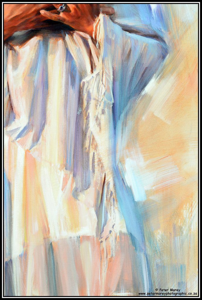
Examples
Here are a few examples of areas where the artist can make deliberate choices that direct and influence the viewer’s perception.
- Colour Choices: Different colours invoke different emotional and mental responses. The artist must not only know whether the colours he uses convey his intentions, but also how to combine them effectively with other colours. In conclusion, scientific knowledge of colours, their combinations and effects is very important.
- Hard and Soft Edges: By using hard and soft edges intentionally, the artist draws the viewer’s eye to focal areas and away from non-focal areas. Hard edges draw attention and focus, whereas soft edges draw attention away from the focal point.
- Texture: Like edges, increased texture and impasto in painting draw the viewer’s attention.
- Design: A long horizontal line, for example, creates a feeling of expanse and peace, while vertical lines tend to divide.
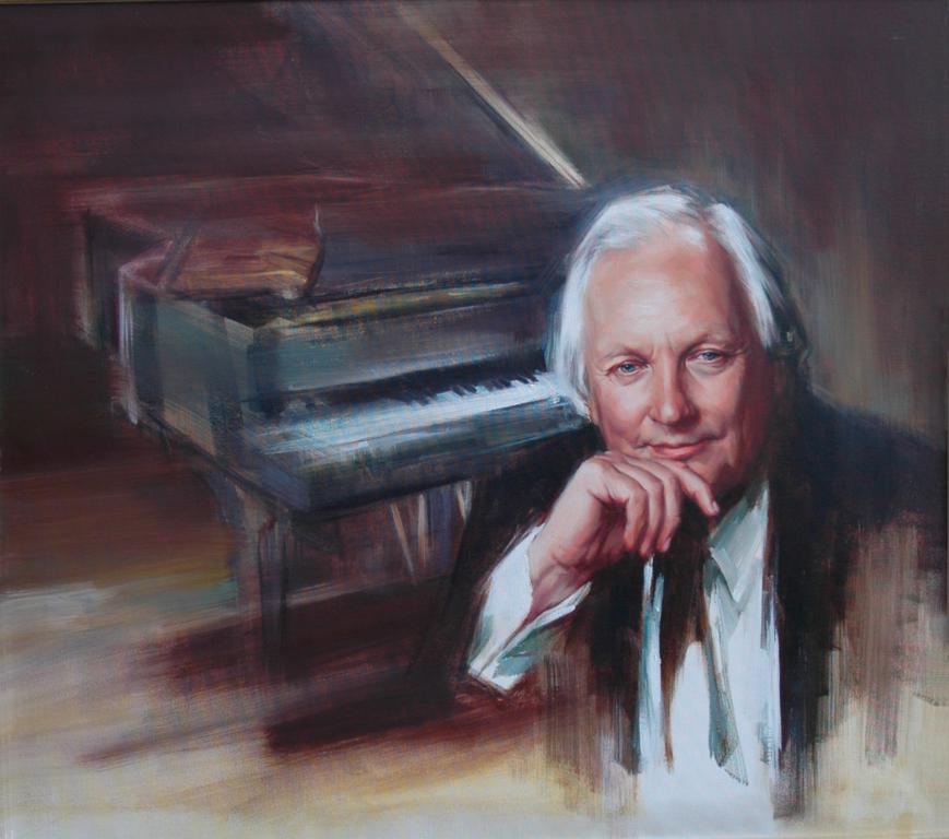
Pretoria, South Africa
In conclusion, inspiration matters, but knowledge and visual vocabulary are even more important because they’re the vehicles through which you communicate your intentions.